

The Cover Up: How America’s Elites Hide Theft in Plain Sight
The greatest trick the American elite ever pulled wasn’t the rigging itself—it was convincing us the rigging isn’t happening.


Sunday we looked at how you rig a whole-ass economy. How $79 trillion got transferred from the bottom 90% to the top 1% since 1975. How we built the technology with our tax dollars and they privatized the profits. How Reagan legalized stock buybacks in 1982 and turned corporations from engines of production into ATMs for executives. How they replaced wages with debt and charged us interest forever.
But here’s the thing that keeps me up at night. Even if we elect a hundred AOCs or Bernies or Mamdanis, folks with genuine intent to fix this system, nothing changes if they walk into office and start working off the same bad data that hid the theft in the first place.
You can’t fix what the data says isn’t broken.
For forty years, costs have soared while damn near everyone in a position to improve our lives has been looking at data telling them everything’s fine. Better than ever, actually. So they do nothing. Or worse, they tell you you’re experiencing an illusion.
The greatest trick the American elite ever pulled wasn’t the rigging itself. It was convincing us the rigging is prosperity for all.
How Systems Protect Themselves Without Anyone Deciding to Lie
I don’t mean to imply an evil plot. It’s more of a collection of self-interest and self-preservation. Motivations that range from political to economic to reputational.
You don’t need an evil cabal at the Bureau of Labor Statistics, the Bureau of Economic Analysis, Treasury, or the Fed if you’ve got institutional capture plus an ideological framework that justifies these decisions.
The through-line here matters way more than catching individual people being villains. What matters is understanding how pressure meets opportunity meets ideology, and how that compounds over decades until the entire measurement system is no longer capturing reality.
1983: When Political Pressure Bent the Measurement
Paul Volcker had raised interest rates to 20%. The Consumer Price Index exploded because it was measuring what was actually happening to mortgage costs. Reagan looks like he’s failing.
Janet Norwood ran the Bureau of Labor Statistics. She found an academically defensible solution. Switch from measuring what it costs to buy a house to measuring what you’d theoretically rent your house for. They called it Owner’s Equivalent Rent.
The measurement gets bent. Not because she’s evil. Because of political pressure meeting opportunity.
This is the backbone of how it works. Each change, individually, can be justified with academic backing. Each one is technically defensible. But together, they create a system where the actual cost of living for regular people gets systematically undercounted.
1995: The Boskin Commission and the Chicago School Framework
Republicans want to cut Social Security without voting to cut it. Alan Greenspan testifies that the CPI is overstating inflation and providing too-generous cost-of-living adjustments. Gives Newt Gingrich cover. Same time, Gingrich threatens to defund the whole agency. Clinton’s White House asks if they can fire the commissioner. They can’t, so they create the Boskin Commission instead.
They hand-pick five economists. Zvi Griliches is one of them. Chicago School guy who pioneered hedonics. It wasn’t random. Griliches was there because his theoretical framework lets you say a car that costs five grand more isn’t really more expensive if it’s “better.”
Markets are always right, dressed up in equations. Further detaching our measures from reality.
That becomes the backbone. Milton Friedman’s Chicago School. Markets are perfect, government is the problem. So they provide the measurements needed to prove it. Griliches’s hedonics were the perfect tool because they’re theoretically rigorous and elegant and they justify making inflation look lower. Which validates the entire Reagan-Volcker axis. Which becomes the framework for how we measure everything going forward.
Once that’s embedded, you don’t need anybody making conscious choices anymore. New economists learn it in school. Think it’s sound methodology. Implement it thinking they’re doing good technical work. The system keeps producing numbers that make the economy look better than it is. Benefits the people who built the framework in the first place.
2010: The Reflex Is Still Active
In 2010, they tried to reclassify “factoryless manufacturers” like Apple and Nike as U.S. manufacturing. It would have counted their offshore production as part of our own, inflating manufacturing numbers overnight and shrinking the trade deficit on paper.
The public caught it and it was blocked. But the attempt shows the instinct to manipulate the measurement didn’t stop in the 80s or 90s. The reflex is always the same. When reality doesn’t fit the narrative, rewrite the measurement.
How They Actually Do It
One of the most often used weapons of the elite is to make even simple things as complicated as possible. Layer complexity on top of complexity. Hide simple truths under mountains of jargon.
Economics is the perfect example. It’s become increasingly convoluted. Not because economics has to be complicated, but because complexity serves a purpose. It obscures theft.
Here’s what oughta matter. How much of your income does it take to buy the basics of life? Food. Shelter. Education. Transportation. Healthcare. That’s the measurement that impacts our lives. Everything else is designed to hide that answer.
A house is a place to live. You trade years of your labor for it. A car is a tool for mobility. You pay what it costs. A college degree is education. You trade money for it. It’s direct. It’s simple. It’s real.
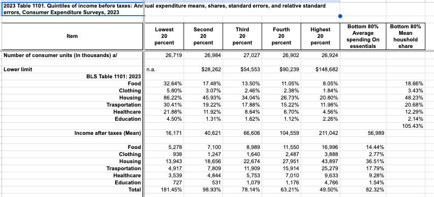
This chart shows you how consumers spend their income. As you can see the bottom 80% of households spend most of their income on the essentials that are being undercounted: food, clothing, shelter, transportation, healthcare, and education.
But economists stopped measuring it that way.
Hedonic Quality Adjustments: Making Price Increases Disappear
If a car costs $5,000 more this year , the government says “Well, it has better safety features and fuel economy, so really only $2,000 of that is inflation.”
You pay all $5,000. They count $2,000.
Let me be clear here. The price of a good is adjusted DOWN if it is perceived to be of better quality. Inflation isn’t just the price of a thing tracked over time. It’s the price adjusted for improvements.
What all do they adjust? Homes, clothing, shoes, new and used cars, washers and dryers, watches, cell service, internet access, all electronics, and so on.
Officially cars are only up 400% since 1969. But it’s really 1,271%. That’s hedonic fuckery.
There is no cheap car anymore. But according to official statistics, inflation is fine because the expensive cars are nicer.
Owner’s Equivalent Rent: How They Hide Housing Costs
For housing, the biggest expense in most people’s budgets, the Bureau of Labor Statistics doesn’t measure what homes actually cost. For homeowners, the Consumer Price Index doesn’t measure actual mortgage payments, property taxes, or insurance. Instead, it estimates the rental value of owner-occupied homes using rental market comparisons.
Housing is the largest expense for most Americans. Measuring it this way systematically suppresses reported housing inflation.
Home prices are officially up 3.7x since 1980. They’re actually up 7x.
Changing Basket and Weighting: Undercounting What Poor People Buy
From Investopedia: “A basket of goods is a collection of items that represent consumer spending patterns. It is made up of a fixed set of goods and services whose prices are used to measure inflation.”
Healthcare costs have exploded, but it’s weighted at 8% of the basket. Electronics have crashed in price, but they get heavier weight. Result? Inflation for the things poor people actually buy gets systematically undercounted.
The genius is that each method is technically defensible. Each adjustment, individually, can be justified with academic backing. Together, they create a system where:
Official CPI: 3.7x since 1980
Healthcare: 13x (adjustment hides 9.3x)
College: 12x (adjustment hides 8.3x)
Housing: 7x (adjustment hides 3.3x)
Food: 5.7x (adjustment hides 2x)
Roughly 50-60% of actual inflation is hidden by these adjustments stacking on top of each other.
What It Actually Costs
How much have the most expensive and income consuming categories changed over time? To see that we will strip away all the adjustments and alterations used to determine inflation. That is where a lot of the mumbo jumbo happens.
Home Prices
Peak affordability was in 1960 when a median home cost $11,900 and a median household income was $5,620. That means a median house cost 2.12x median family income.
In 2023 the median home cost $429,000 and median household income was $80,610. That’s 5.32x median income.
But, Corbin, houses are so much bigger now! You can’t compare them. We have mansions and live in the lap of luxury. It’s not an affordability crisis, it’s just that homes got nicer.
Here’s the problem. That’s not what happened to the homes people actually buy.
New homes? Yeah, they got bigger. But new construction is about 1% of the housing stock each year. Most people don’t buy new homes. They buy existing homes. And the existing stock, the actual market where real people shop, went from a median of 1,610 square feet in 1985 to about 1,800 square feet today.
That’s only 190 more square feet. 11% growth in size since 1985 but a 518% increase in price. Household income went up by 340% over that same time, far outpaced by housing prices.
4-Year College Degree
In 1960 a full 4 year degree cost an average of $852. Less than 2 months of median family income for the whole damn degree. All 4 years.
In 2023 that same degree cost nearly $40,000. More than 6 months of median family income. That is an increase of 4600% while incomes only rose 340%.
And where is that money going? Better educations? Smaller class sizes? Nope. In 1959-60, with 3.6 million students and 380,554 faculty, the estimated ratio was 9.6:1. But today the number is 18:1.
What increased was administrative bloat. That went up from student/admin ratios of 84:1 in 1975 to 6.3:1 today. Six students per administrator. If only they taught.
Healthcare Per Capita
In 1970 healthcare spending per capita was $353 or 3.5% of median household income.
In 2023 it was $14,570 or 18% of median income. An increase of more than 5x.
Oh but we live longer now, Corbin!
In 1970 if you made it to 65 years old, men had an average of 13.1 years left and women 17.1. Today if you make it to 65 years old, men have 18.2 years left and women 20.7. So over the past 55 years men added 5.1 years and women 3.6. Most of those additional years are spent sick and dying but hey, you’re alive.
What One Person Could Do Then vs. Now
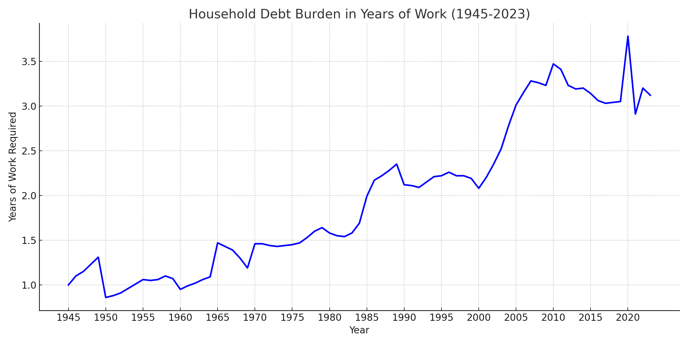
Here is a chart that shows unadjusted purchasing power, just cost vs income (orange for renters, and red for home buyers), and the OFFICIAL metrics (blue). See which one feels more accurate.

Here’s what happens when you strip away the bullshit and just look at what one person could do before vs. now.
In 1950, median personal income was $1,971. A median home cost $7,354. You needed 3.73 years of work to buy a house.
In 2023, median personal income was $42,220. A median home cost $429,000. You need 10.16 years of work.
That’s nominal to nominal. No adjustments. No hedonic quality assumptions. Just how much do you make, and how many years of your working life do you have to trade for shelter?
These numbers don’t need adjustments. They’re real. They’re what people actually live with. And they show a system in free fall.
So, 2023’s $42,220 median income? To match what our grandparents could actually buy in 1950, we’d need to make $102,024.
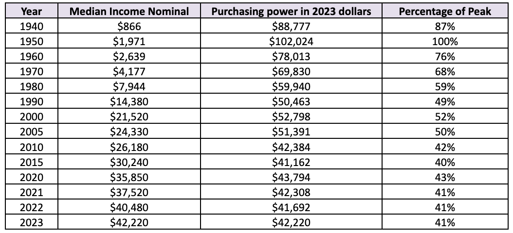
This isn’t just about prices going up—it’s about how much our paycheck can actually buy.
The Debt Mask
There’s another layer to this. When official statistics say consumption is up, when they claim Americans are buying more goods and services than ever, they’re counting debt as income.1
Americans aren’t buying more because they’re richer. They’re buying the same stuff on credit because wages are stagnant.
Someone puts food on a credit card they can’t pay off. The BLS counts that as “consumption.” GDP goes up. The economy looks great on paper.
Someone extends their mortgage from 15 years to 30 years, or Trump’s new 50 year mortgage, to lower their monthly payment. They pay more interest, work more years, but the debt-to-GDP ratio looks better. The economy is a boomin!
Someone’s working two jobs instead of one. That second income gets added to the household total. GDP grows. Another person enters the labor force. Another notch on the “participation” chart.
We’re layering desperation on top of manipulation and calling it growth.
The Government Money Shell Game
About half of healthcare spending comes through government programs. Medicare, Medicaid, VA. The government writes the check, but people still have to pay. Through taxes. Through higher premiums. Through delayed care. The cost doesn’t disappear. It just moves. It hides.
So when official statistics show household healthcare spending that seems flat, it ignores the government handouts to insurance companies.
The truth is simple. Healthcare costs have exploded. We’ve just hidden half the bill in government budgets instead of putting it on people’s bank statements.
Same effect. Different accounting. Makes the extraction invisible.
Why This Is Important
When the official story becomes completely detached from reality, people stop believing institutions. Not because they’re irrational. Because the institutions are lying.
You know you’re drowning. Your bank account knows it. Your family knows it. Every month you make the decision between medicine and food, between car repair and electricity, between saving for retirement and paying this month’s bills.
And then an intelligent guy with a platform tells you that you’re experiencing an illusion. He convinces your favorite politician of the same lie.
So people stop trusting experts. That’s when they reach for someone, anyone, who acknowledges that something’s wrong. Even if they’ll probably make it worse. Even if that person is Donald Trump.
At least they seem to believe you when you say you are drowning.
The longer we ignore this problem the deeper the institutional distrust becomes.
You can’t fix a problem you can’t see, especially if it’s hidden by design. We have to arm ourselves and our leaders with the right information.
Corbin Trent
This is the second essay in a 12-part series where I lay out how we got to where we are and the next steps required to move forward. You can find the first essay here. The third essay will be published at America’s Undoing on Thursday November 13.
On December 9th I’ll be announcing a new initiative designed to bring power to the people, not the wealthy.
Please join me on the journey by subscribing and sharing, and let me know what you think in the comments.
Paul Shattuck made a good point. He suggested I didn't name names and motivations clearly enough in my piece. So here you go.
Paul, you're right I don't mean to imply an evil plot. It's more of a collection of self interest and self preservation. Motivations that range from political to economic to reputational.
I think the through-line here matters way more than catching individual people being villains. You don't need an evil cabal at BLS, BEA, Treasury, or the Fed if you've got institutional capture plus an ideological framework that justifies and drive these decisions.
Some of the worst of this started in 1983. Volcker had raised rates to 20%, the CPI exploded because it measured what was actually happening to mortgage costs. So Reagan looks like he's failing. Janet Norwood ran the BLS. She finds an academically defensible solution which was switching to measuring what you'd theoretically rent your house for instead of what it costs to buy (OER). The measurement gets bent. Not because she's evil. Because of political pressure and opportunity.
Then in 1995. Republicans want to cut Social Security without voting to cut it. Good ole Greenspan testifies the CPI is overstating inflation and providing generous COLAs. Gives Gingrich cover. Same time Gingrich threatens to defund the whole dang agency. Clinton's White House asked if they could fire the commissioner. They can't so they create the Boskin Commission instead.
They hand pick five economists. Zvi Griliches is one of them. Chicago School guy who pioneered hedonics. It wasn't evil but it also wasn't random, Paul. Griliches was there because his theoretical framework lets you say a car that costs five grand more isn't really more expensive if it's "better." Which is just markets are always right dressed up in equations. Further detaching our measures from reality.
That's the backbone. Milton Friedman's Chicago School. Markets are perfect, government is the problem. So the braintrust provides the measurements needed to prove it. Griliches's hedonics were the perfect tool because they're theoretically rigorous and elegant and they justify making inflation look lower. Which validates the entire Reagan-Volcker axis. Which becomes the framework for how we measure everything going forward.
Once that's embedded, you don't need anybody making conscious choices anymore. New economists learn it in school. Think it's sound methodology. Implement it thinking they're doing good technical work. The system keeps producing numbers that make the economy look better than it is. Benefits the people who built the framework in the first place.
And this instinct to manipulate the measurement didn't stop in the 80s or 90s. In 2010, they tried to reclassify "factoryless manufacturers" like Apple and Nike as U.S. manufacturing. It would have counted their offshore production as part of our own, inflating manufacturing numbers overnight and shrinking the trade deficit on paper. The public caught it and it was blocked, but the attempt shows it's still active. The reflex is always the same when reality doesn't fit the narrative, rewrite the measurement.
That's your cultural hegemony. More powerful than conspiracy because nobody has to agree to it. People are just doing what they genuinely think is right work inside a framework that was designed under pressure to serve a specific vision. A vision that served people with power.
The effect is forty years of measurements that hid the actual cost of things, hid the real decline in what work is worth, made extractive policies look successful. And nobody had to meet in a room about it. It just became the water everybody swam in.
I reckon I am a little obsessed with this because even if we elect a hundred AOCs or Bernies or Mamdani’s; folks with genuine intent to fix this system, nothing changes if they walk into office and start working off these same bad measurements.
You can't fix what the data says isn't broken. Know what I mean?
"One of the most often used weapons of the elite is to make even simple things as complicated as possible. Layer complexity on top of complexity. Hide simple truths under mountains of jargon."
I had to stop right there, because there's an excruciatingly important detail missing: It's not a weapon of only the elite!!! Saying it is makes it convenient to blame the elite and miss the truth: It is the weapon of incompetents masquerading as superiors, and those folks exist within every level of society, not just within the elite level. If we want change to LAST, we must have the courage to see the painful truth instead of going for the luscious target.
When I look back at my various jobs and previous career, I got a good hard look and hands on experience of those who are toxic as hell, slowing everything down, making things harder than they ever needed to be, and never doing the right thing unless forced to, and they are what you speak about the elite, but they were far from elite: They made even simple things as complicated as possible, with jargon being their crutch because they have astute memory ability, so jargon comes easy to them even though they know not what they speak other than superficially. I know, because I redid their work at every opportunity, omitting all the duplication, unnecessary, and flawed steps, leaving flawless efficiency in its place.
Quite frankly, our governance system is complicated and slow by design, allowing all manner of criminality, corruption, and greed to satiate the toxic, who see what I see and laugh because most people don't or won't. But the "cutting" the current regime and it's moronic minions propose is the opposite of a solution, and they delight in destruction, because they are who I said they are: Incompetents masquerading as superior, who just happened to have conned their way up the ladder, because good people refuse to see the painful ugly truth of the toxic.